
Share This Article
Winter is loosening its grip. The days are becoming longer and warmer, and as colour returns to the world through bud burst and bloom, the urge to reset your space is setting in.
One of the simplest, highest-impact ways to do that is to refresh the colour on your walls. Spring, with its returning greens, soft blossoms and clear open skies, is a naturally inspiring colour reference.
The ‘fifth wall’ and the art of colour drenching
Designers are increasingly treating the ceiling as a surface with as much potential to add personality and atmosphere as the four walls of a room.
Colour drenching, pulling a single hue across every surface in a room (walls, ceiling, cornices, skirting and trim), has been building momentum for a couple of years, but the trend has shifted. Homeowners once kept it safe with neutrals; now they’re going bold. Think a room drenched in the blushed depth of Ruby Tuesday (R5-B2-2), or ceiling, walls and trim unified in the unapologetic red of Hot-N-Spicy (R6-B1-1), both from Plascon’s Fashion + Candy Colour World.
If a full colour drench feels like a stretch, there is plenty of personality to be found in the details. Run a shade that contrasts your walls along your skirting boards and door frames for a finishing touch that makes a room feel considered and complete. If walls feel like a large undertaking, revive a tired set of dining chairs in the rich burst of Signal Red (G7) or give a side table a new lease of life in the warm glow of Good Day Sunshine (O6-A1-1) from Plascon’s Orchard + Blooms Colour World. Even a bookshelf interior painted in Cave Painting (O2-C1-1) can completely transform a room corner. Small decisions, made with intention, go a long way.
Invite the outdoors in
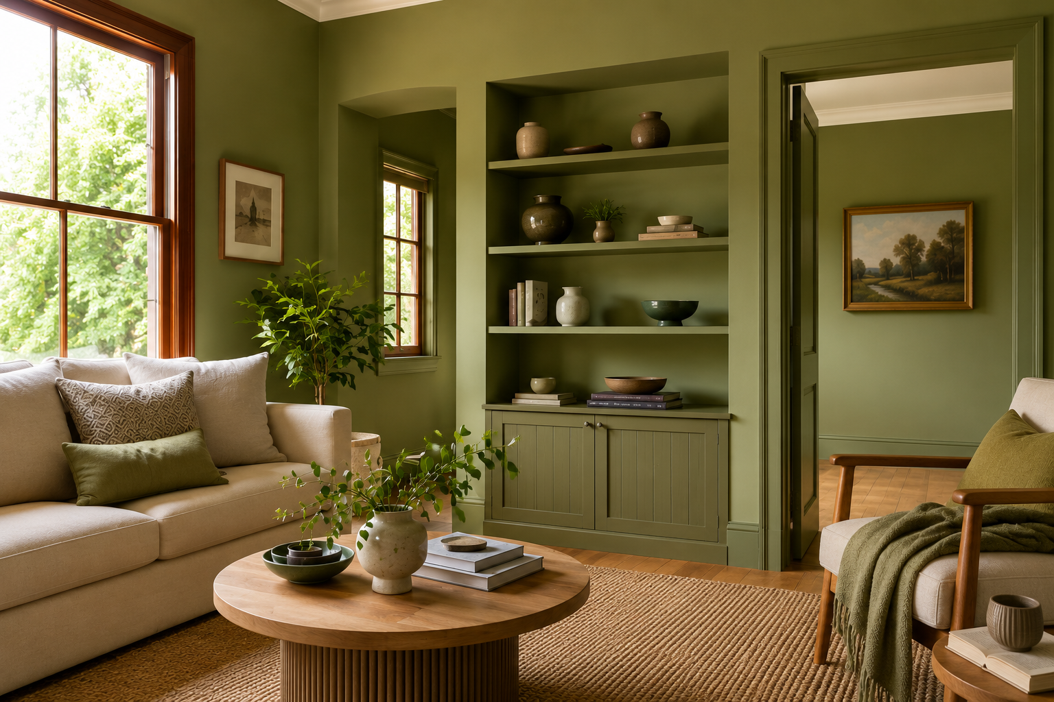
Dissolving the boundary between indoors and outdoors doesn’t always require structural renovation. It can be as simple as drawing inspiration from the landscape right outside your window: the rough grain of tree bark, the softness of moss underfoot, the cool smoothness of river stones. Translate these tactile references into the right paint colour to feel more grounded in nature.
Plascon’s Land + Sea Colour World presents a colour palette that feels as though the hues have been lifted directly from the landscape. Rooted in the organic world of bark, moss, lichen and tidal water, it brings together shades such as African Mud (O2-E1-1), Olive (G2-E1-2), Frog Pond (Y6-D1-1), and Evening Stroll (G6-C2-1). Consider using them in a living area, a sunroom or a transitional space.
A vintage colour resurgence
Butter yellow has arrived alongside a broader revival of modernised 1970s colour sensibilities that feel warm, earthy and timeless rather than trendy. Julia (Y3-A2-2) from Plascon’s Butter + Sky Colour World brings that signature softness to any room, while Blazing Sun (Y4-A1-4) offers a bolder option for those who want their walls to make a strong statement. For a grounded, nature-inspired take on the trend, consider the olive green of Wanda (Y4-C1-1) for an accent wall, or let your front door shout ‘spring!’ in the vibrant orange of Good Day Sunshine (O6-A1-1) from Plascon’s Orchard + Blooms Colour World.
Whether you drench a room in an unexpected hue or bring the colours of the garden inside, a little paint goes a long way. Visit plascon.co.za to explore the full 2026 Colour Forecast and find the palette that makes your home feel like spring.
Discover more DIY tips at plascon.co.za.
About Plascon
Plascon has led the way in the coatings business since 1889. The company continues to innovate with a focus on developing pioneering products while being conscious of its environmental impact. With an extensive range of high-performance decorative, automotive, industrial and professional coatings, Plascon is set to continue as South Africa’s coatings company of choice.